

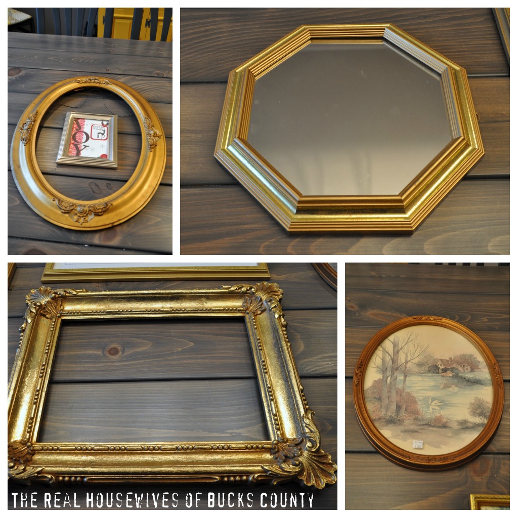
It’s been a while since we’ve talked about my dining room… that could be because I’ve been scouring the earth to find ornate frames. I like to call them Granny Frames (Ha! I almost typed Granny Panties!) I’m obsessed with funky, ornate frames and guess what?? They’re impossible to find lately.
Who’s buying up all my granny frames?
Here’s the plain wall, just waiting for something fab-u-lous! I just know I’m going to adore the stark contrast between the simple frame outlines on the wallpaper and the fancy-schmancy frames I’m hanging.

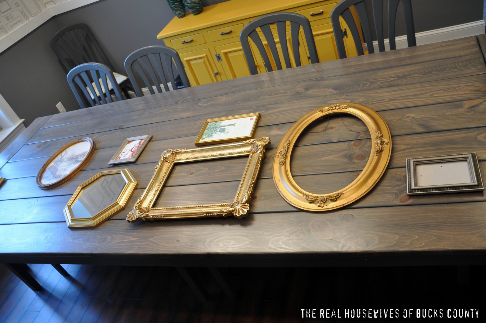
First things first, I needed an arrangement. I used my dining room table to try out some layouts…
Option 1 (sorta looks like I just tossed them there)
Option 2
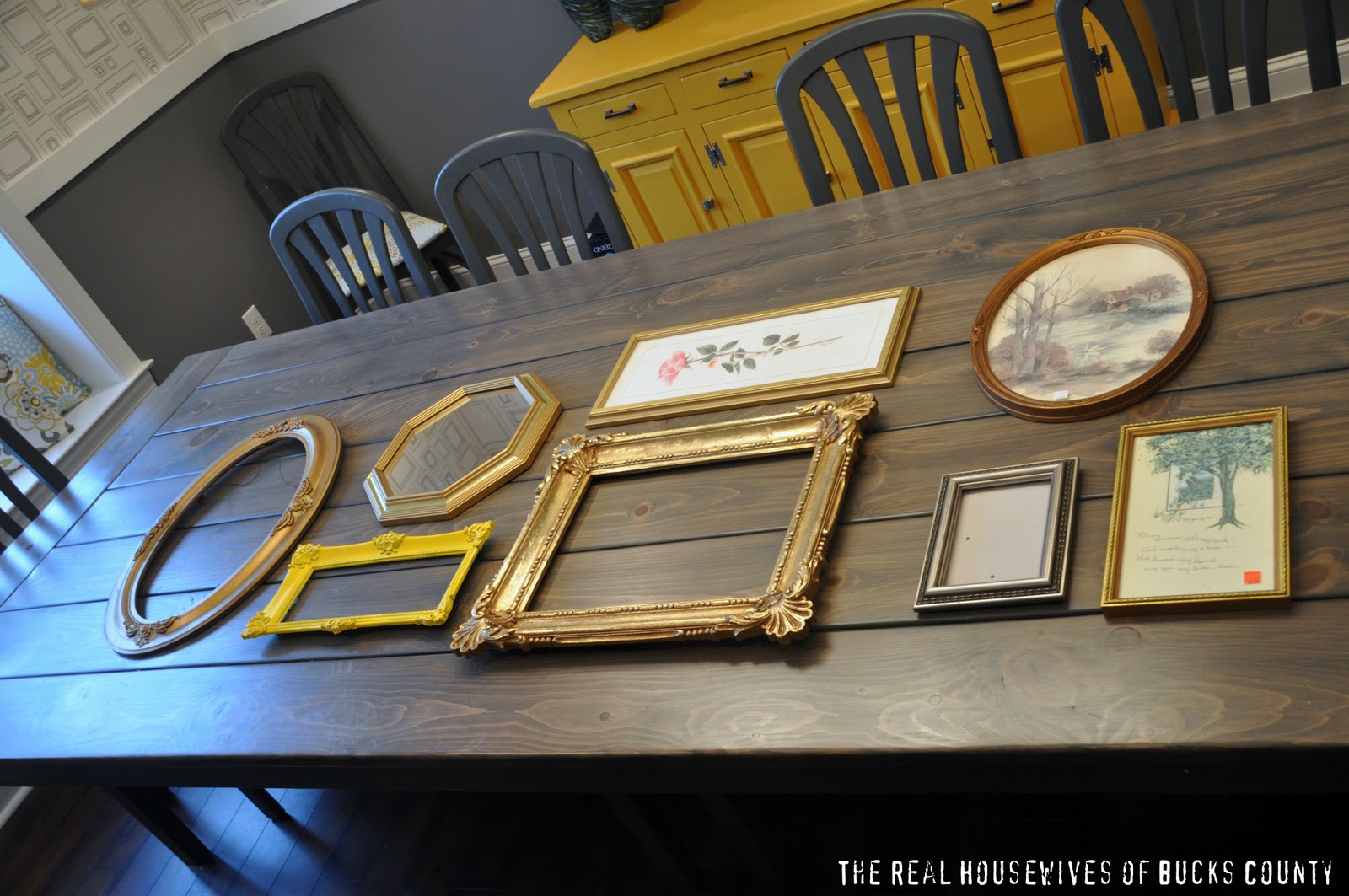
Option 3- My Fav!

Before I commit to a layout, I’m going to use kraft paper to make templates and tape them on the wall. I can’t risk putting tons of holes in my precious wallpaper!
The final decision I still need to make is what color to paint the frames… I was leaning towards turquoise, but I’m totally open to suggestions. Remember, the room is yellow, grey, white, and some black.
Help a girl out with some advice!
P.S. Thanks sooo much for all of the wall stencil input! I’ve made my decision, but you’re going to have to wait and see! Actually the reason for the delay is that I’m just swamped with Nate Show projects, and won’t have time to finish it for a few weeks. The half finished wall is seriously staring me down on a daily basis!


I love the 3rd option! And the turquoise idea. Could you not, instead of putting holes n your wallpaper, use the command hooks? More easily moveable and no permanent damage. LOVE your blog, just found it recently!
I say a color in the Red family! 🙂
I also like your favorite option! About the color… I think you have some blue on those curtains, right… I like your idea of painting them turquoise, but I guess it depends on what kind of turquoise and if you want to have a bold effect or something more subtle…. I like the yellow and grey, and that yellow frame already looks great…but I am not sure if I would paint them all yellow…..
did I help at all?? 😀
Mercedes @ ravenography.blogspot.com
Just a thought…. And I haven’t had coffee yet so no clue on if this is actually a good idea….what about Kelly green?? May be a fun pop and it normally plays nice with yellow and grey. Ok…. Coffee time;)
yellow
Turquois would be lovely! I was thinking some turquois and some white…
What about navy blue or even another gray? I also like yellow. I am not a big of the turquoise in a room with those colors.
Just a thought, I was looking at the logo at the top of your blog and it is pretty much the colors of your dining room. So what about the sky blue you have in the circle on the logo next to the grey? It works there so it may work for the frames.
I think purple, teal, black, and mustardy yellow would look pretty awesome.
I am loving the already-yellow frame and think that would look pretty great and very modern against the frame wallpaper 🙂
My opinion is some of ALL the colors, yellow, grey, white (distressed) and black! That way it pulls it all together….Just a thought! I too like the option #3, its a great happy medium of showing off all the frames! Happy painting….