
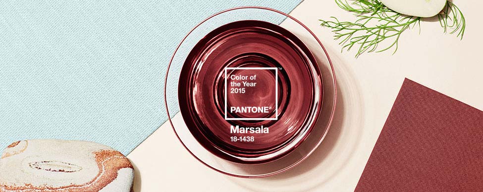
When the Pantone Color of the Year for 2015 was announced it had been met with mixed emotions by EC2 readers.
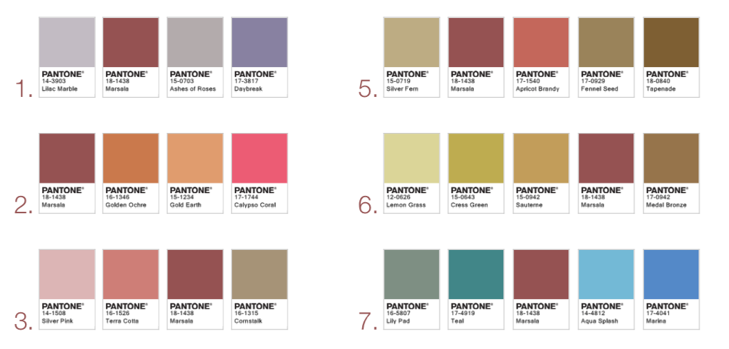
Pantone’s 2015 Color of the Year…Marsala.
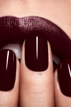
It seems like everyone is okay with the color for nails, lips, and anything fashion related, but pretty skeptical of how marsala will work within interior design and spaces.
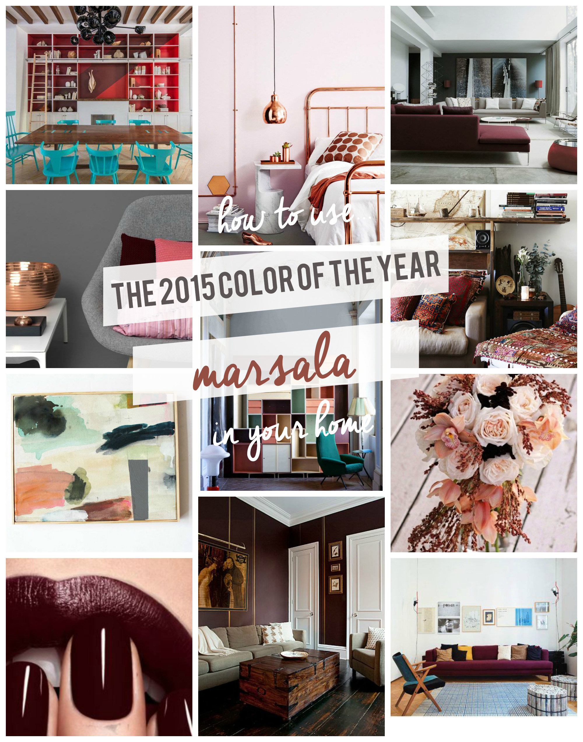
Pantone is confident in Marsala’s versatility, but I thought it would be fun to dig around for awesome spaces already using the color. I’m gonna convince you it’s deserving of its color of the year title.
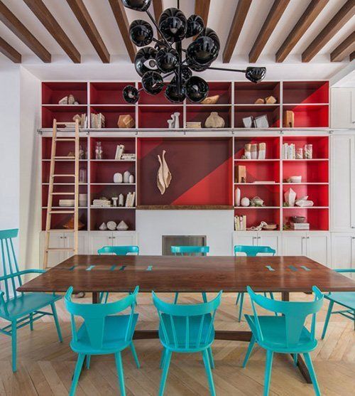
Paired with red and aqua.
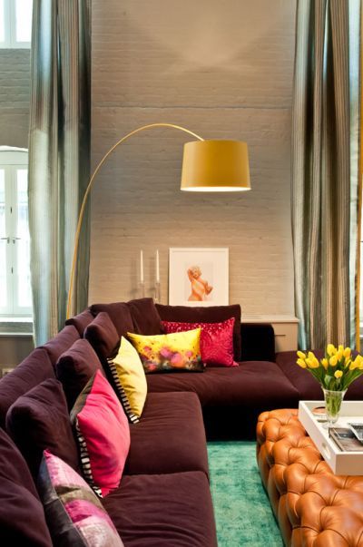
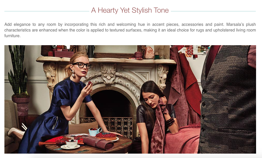
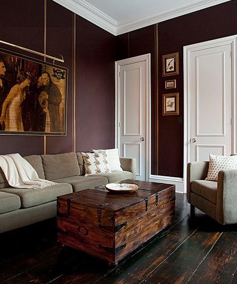
Marsala pairs well with with warm leather and even cheeky, bright pinks.
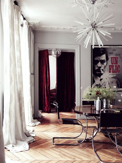
Even though Marsala is kind of a rich tone that works well with warm, saturated colors, I love how it looks in this light grey and white space.
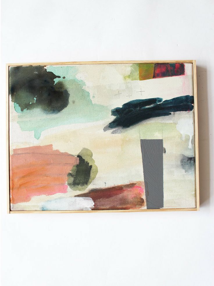
Each of the colors in this piece of art work well as accents with Marsala. I’ve been on the blush and deep green train for a while now, and I think that Marsala is the perfect addition to my love affair.
Personally, I don’t think I plan to use Marsala as my main color in a space, but this room shows that it definitely works.
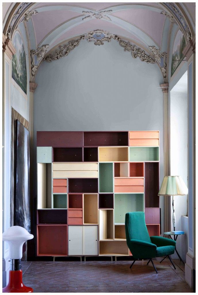
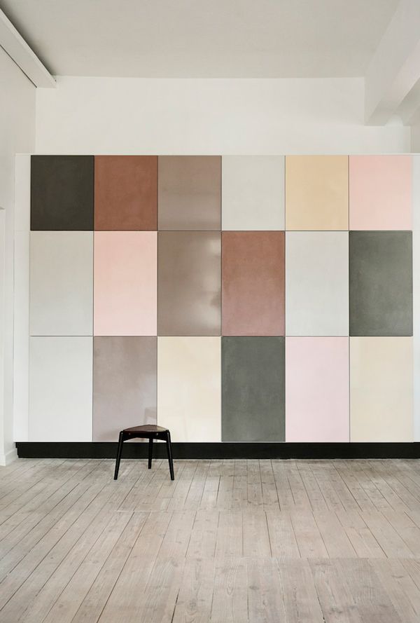
These modern shelving cubes are incredible and the marsala looks oh so yummy with mint, pinks, peaches, pale yellow, and deep teal. Seriously, is there a color it doesn’t go with? I’m not so sure!
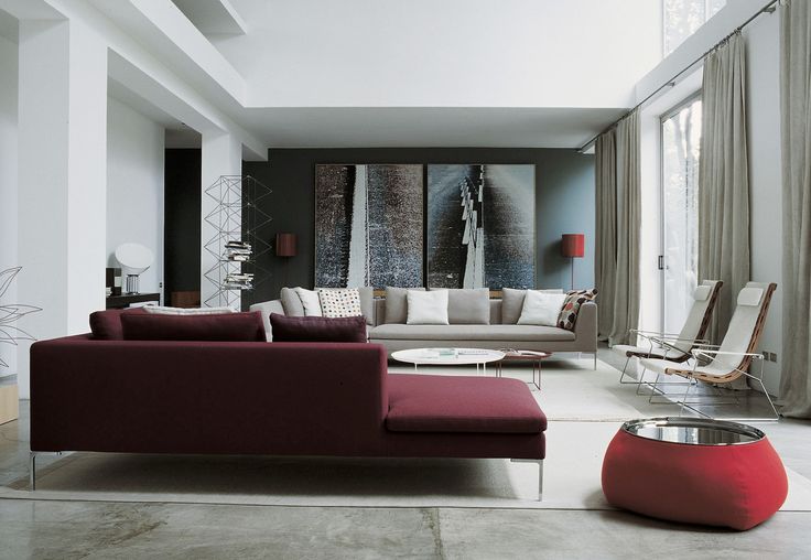
This is how marsala plays as a cool, modern tone.
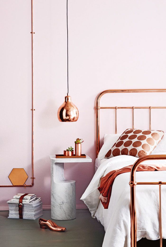
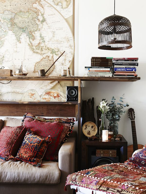
Now this space doesn’t necessarily have marsala in it, but I think the brown throw and pillow could easily be replaced with it. I think it’s meant to be with copper and rose gold!
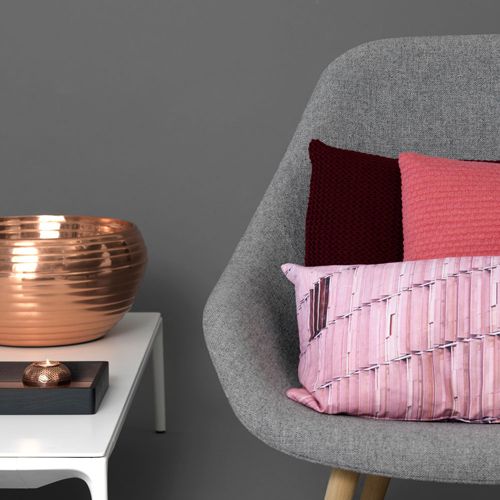
This is right in my style sweet spot lately… a few fun shades of pink, marsala, grey, and copper. It’s so, so good!
A more muted use.
Southwest or Aztec style is the more obvious choice for Marsala. It might be obvious, but I still love it.
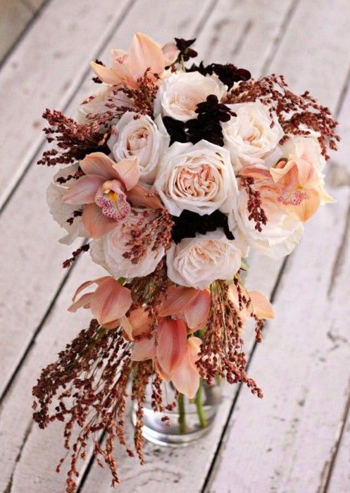
Clearly this isn’t a room, but I think that the wedding world was onto Marsala and it’s color combos for a long while now.
Speaking of color combos, here are the suggestions from Pantone and then a few I like.

Okay, I’ve gotta know. Have I convinced you that Marsala can work for interior spaces?
What do you think of the Pantone’s 2015 Color of the Year?
Did you know East Coast Creative’s Most Popular Blog Project of all time is now for sale?!?
Get Ready to Break Up with Your Bedtime Routine!
Check out our online store!


Still not liking it for home decor – only like it for lips and nails.
How can I find out this exact shade of nail polish and lipstick and where to purchase it
that’s what I want to know too! Anyone????
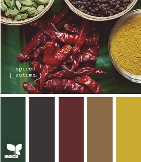
I love it already! It’s great paired with mustards, olive greens, golds and coppers and even slightly surprising touches of lime! I will say that it’s a colour I’d use more from Autumn (Fall) through Winter though.
Nikki x
Sure, I suppose it could work, but why follow a trend.
I like some of the examples you’ve shown here. For me, it would not work as a main color just because of my home arrangement, lighting, etc., but I would very much use it as an accent color or as a neutral. Thanks for these interesting ideas!
I love it. The silk curtains in my bedroom are Marsala or something close to it.
Interesting… thanks for sharing this! I would love Marsala curtains in an office or den!
I like it as an accent. It’s too rich for me to see it on a large expanse such as a wall or large drapes because it would demand all of the attention.
I think is great actually! I love the color and think it adds a lot of warmth to decor. Marsala seems a little more timeless than hot pink or chartreuse or chevron. Don’t get me wrong, I love a good print!
[…] 3. Dream Book Design. 4. Mind Sparkle Mag. 5. Bodie and Fou. 6. Flickr. 7. House of Turkoise. 8. East Coast Creative Blog. 9. The Every Girl. 10. Yvonne […]
[…] via eastcoastcreativeblog […]
[…] Image found here […]
[…] for this mood: Pantone / East Coast Creative / […]
[…] 2 | 3 | 4 | 5 | 6 | 7 | […]
What is the name/brand of the nail polish color?
[…] My first thought about Marsala was that it reminded me of 90’s maroon. But with all of the black, white and gray in interiors these days, Marsala could be a nice, rich compliment. What do you think of it? Maybe you’ll try it on some accessories? See ideas for using Marsala in your home from Monica at East Coast Creative. […]
love this color.cosy and deep,rich.I am noticing across this color everywhere since Pantone announced Marsala for the color of the year 2015 and for sure I like it in the rooms,interiors.I have lovely vintage glass coasters in this color!
[…] eastcoastcreativeblog.com […]
[…] Via: eastcoastcreativeblog.com […]
[…] Via: eastcoastcreativeblog.com […]
[…] https://eastcoastcreativeblog.com/2014/12/pantones-2015-color-year-marsala-use-home.html […]
[…] Left Image Photo Credit […]
[…] via Anthropologie […]